
In the vast and colorful world of graphic design, precision is vital. From the pixel-perfect alignment of elements to the harmonious blend of colors, graphic designers rely on various measurement systems to bring their creative visions to life. In this article, we will explore the diverse landscape of measurement systems used by graphic designers, exploring their nuances and applications.
Pixels: The Building Blocks of Digital Design
In the realm of digital design, pixels reign supreme. A pixel, short for “picture element,” is the smallest unit of a digital image. Graphic designers use pixels to determine the dimensions and resolution of images, ensuring clarity and crispness across various digital platforms. Whether crafting a website layout or designing a social media graphic, understanding and working with pixels is fundamental for digital designers.
Pixels Per Inch
Pixels per inch (PPI) is a measurement used to express the resolution of a digital image, specifically the number of pixels contained in one inch of the image. It is a crucial metric in both digital design and printing, influencing the clarity and quality of visual content.
In digital design, PPI refers to the density of pixels within an image displayed on a screen. The higher the PPI, the more pixels are packed into each inch, resulting in a sharper and more detailed picture. For example, a screen with a resolution of 300 PPI will display a more detailed image compared to a screen with a resolution of 72 PPI.
PPI is closely related to dots per inch (DPI) in printing, although the terms are mistakenly used interchangeably. PPI specifically pertains to the digital image’s resolution, while DPI refers to the resolution of the printed output. To achieve high-quality prints, the PPI of the digital image must align with the printer’s DPI capabilities. Standard print resolutions often range from 150 to 300 DPI, and images intended for print are typically prepared at a higher PPI to ensure crisp and clear results.
High-Resolution Image
An image is “high resolution” when the pixels per inch are above 200 PPI at the output size.
Low-Resolution Image
An image below 150 PPI at its output size is considered “low resolution.” When images are low-resolution, they may appear pixelated and blocky.
Inches and Centimeters: Bridging the Physical and Digital
As graphic designers often struggle between digital and print media, traditional measurement systems like inches and centimeters remain relevant. Print design requires careful consideration of physical dimensions, and inches or centimeters provide a tangible framework for creating brochures, posters, and other printed materials. Understanding the conversion between digital pixels and physical dimensions is crucial for consistency across different mediums.
Points and Picas: Typography’s Delicate Balance
Typography, the art of arranging type, introduces its dedicated measurement systems – points and picas. Graphic designers use these measurements to establish consistent and proportional spacing, font sizes, and layout in printed materials.
Points
In typography, a point is a standard unit of measurement. There are 72 points in one inch. Designers use points to set font sizes, line heights, and other text-related properties. For example, a typical body text size might be 12 points, while headings or subheadings may have larger point sizes.
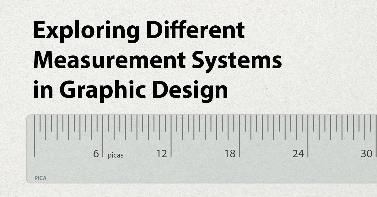
Picas
Picas are derived from the point measurement system, with one pica equivalent to 12 points. Picas are particularly useful for layout design, providing a more flexible unit for column widths, margins, and other spatial elements.
Defining Page Layout
Points and picas are foundational units in page layout design, allowing designers to create consistent and visually appealing layouts with well-proportioned text and spatial elements. Their use in establishing grids, defining typography, and structuring the overall layout contributes to printed materials’ readability and aesthetic harmony.
Picas in Column Widths and Margins
Designers often use picas to define the width of columns, margins, and other structural elements in a layout. This modular approach helps maintain a consistent and aesthetically pleasing grid structure. For example, a layout might have columns that are 20 picas wide with a one pica gutter between them.
Baseline Grid
Points and picas are crucial for establishing a baseline grid, a series of horizontal lines that ensure alignment and consistency in the vertical spacing of text and other elements. Using multiples of points and picas (since they are based on 12), designers create a grid that facilitates easy alignment and readability throughout the document.
Leading (Line Spacing)
Leading refers to the vertical spacing between lines of text. Designers use points to set the leading, ensuring the space between lines complements the chosen font size. For instance, if the font size is 10 points, the designer might set the leading to 12 points to provide sufficient space for readability.
EMs and REMs: Scaling Typography Responsively
In the era of responsive web design, graphic designers have embraced relative units like EMs (em-width) and REMs (root em-width) to create flexible and scalable typography. These units are based on the parent element’s font size, allowing designers to maintain consistent proportions across different screen sizes. EMs and REMs are vital in crafting user-friendly and visually pleasing websites that adapt seamlessly to various devices.
Conclusion
Mastering various measurement systems is crucial for achieving precision and consistency in the ever-evolving graphic design landscape. Each system serves a unique purpose in the creative process, from pixels and inches in digital and print design to points, picas, and relative units for typography. Embracing this diverse palette of measurement tools empowers graphic designers to bring their visions to life with precision and flair, ensuring their work resonates across many mediums and platforms.
References
OpenAI. (2024). ChatGPT (Jan 2 version) [Large Language Model]. https://www.openai.com/
Prompts I Used:
- Please write me a blog post about graphic designers’ different measurement systems.
- Define what pixels per inch are.
- How are points and picas used in page layout design?
Image Sources
- Pencil image by cyberscooty from Pixabay
- Fractional Scale image by Offnfopt from Wikimedia