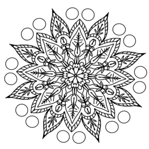
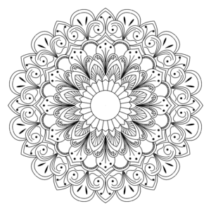
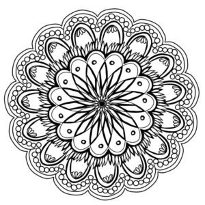
Whether you’re pursuing a degree in graphic design or want to improve your skills for personal projects, color is one of the most critical aspects of design. Color can evoke emotions, convey messages, and create a mood. But how do you choose the right colors for your design? One way is to use color harmonies. In this project, you’ll create color harmony mandalas using Adobe Photoshop.
What are Color Harmonies?
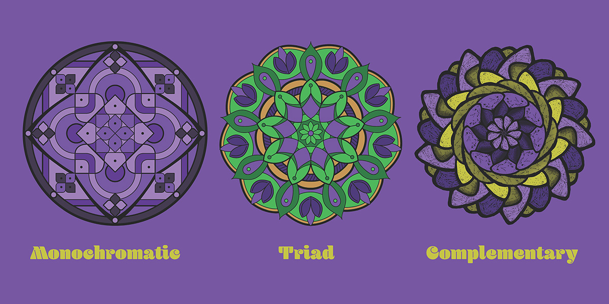
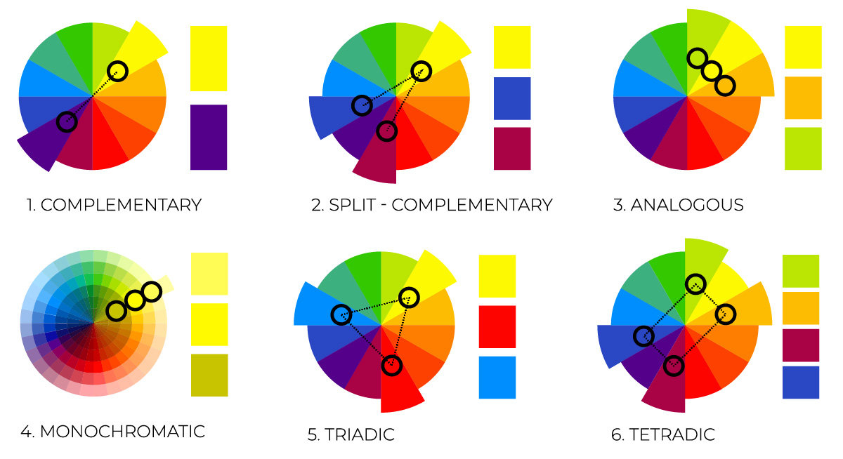
Color harmonies are combinations of colors that work well together. There are several types of color harmonies, including monochromatic, complementary, analogous, triadic, and tetradic. Each type of harmony has a different effect on the viewer and can be used to convey other messages.
A designer may choose monochromatic color harmony to create a simple, cohesive design. Monochromatic color schemes use variations of the same color, making a sense of sophistication and elegance. Complementary colors are opposite on the color wheel and create a vibrant and energetic contrast. Analogous colors are next to each other on the color wheel, creating a harmonious and calming effect. Triadic colors are evenly spaced on the color wheel, creating a balanced and dynamic look. Tetradic colors are two complementary color pairs and make a bold and colorful effect.
Consider the Mood
When choosing colors for your design, consider the mood you want to convey and the message you want to communicate. For example, if you’re designing a poster for a music festival, use complementary colors to create a vibrant and energetic look. If you’re designing a flyer for a yoga class, use analogous colors to create a calming and peaceful effect.
Readability Matters
Remember also to consider contrast and readability when choosing colors. Ensure the text is readable against the background color and that the colors don’t clash or overwhelm the design.
In conclusion, using color harmonies in your graphic design can take your work to the next level. Experiment with different types of harmonies and see how they affect the mood and message of your design. With practice and attention to detail, you’ll be able to create stunning designs that are beautiful and effective.
What are Mandalas?
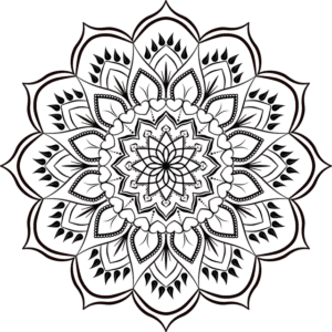
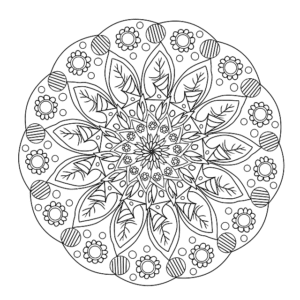
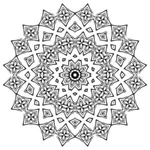
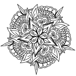
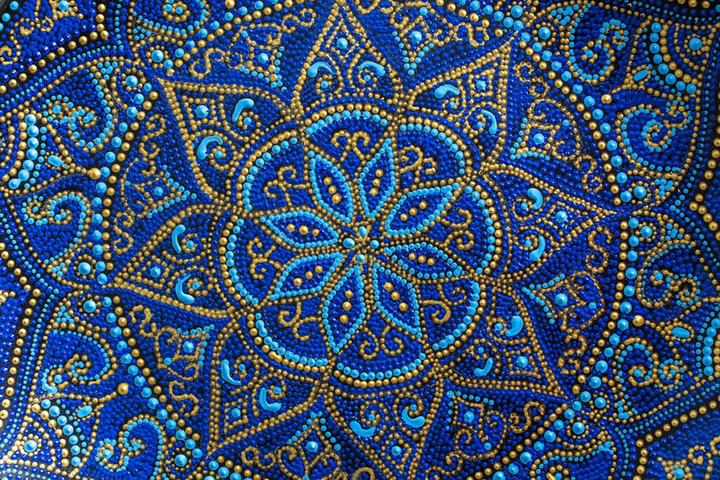
Mandalas are intricate and symmetrical designs used for centuries in various cultures and spiritual practices. The word “mandala” comes from the Sanskrit word for “circle” and represents the universe and the infinite nature of existence. Mandalas often feature geometric patterns and shapes radiating from a central point. They are used for meditation, reflection, and healing purposes. Mandalas can be found in various forms, including paintings and sculptures, and even in nature, such as in the circular patterns of flower petals or snowflakes.
Create Color Harmony Mandalas
Learning Targets
- I can identify and use different color harmony rules.
- I can use the Color Range Tool to isolate linework in Adobe Photoshop.
- I can use the Paint Bucket Tool to fill areas with color in an image.
Project Overview
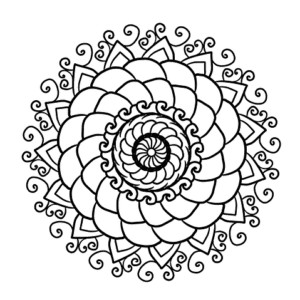
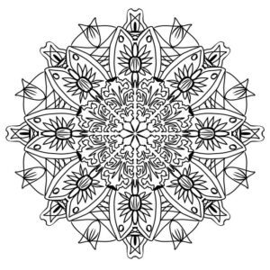
Choose three different mandalas from the provided resources to use for the project. Using http://color.adobe.com, choose a monochromatic color harmony, a triad color harmony, and a complementary color harmony based on a single base color to apply to each mandala. Then, color each mandala with the corresponding color harmony using Adobe Photoshop and the video resources below. Add labels and go above and beyond to make the project unforgettable!
Design Specifications
- Color Mandalas in Adobe Photoshop
- 12″ x 6″
- 300 PPI
- Landscape Format
- Export as JPG
File Submission
- JPG file: Lastname, Firstname – Mandalas.jpg
