This year I noticed one of my students watching a video by Benny Productions, where he was in an edit race with another designer. So, we set off to try and build a class Photoshop editing challenge based on this concept.
Background
While I’d love to take credit for the idea, some of my students tried to implement the challenge independently. By watching their process and struggles, I revisited the idea and re-designed the challenge to work in a classroom setting.
One of the first realizations was the quality of the images was paramount to the project’s success. The students did not spend time vetting the photos for quality and focus, making selecting portions of the image a challenge. Second, the students struggled with the limited amount of content creatively. They grew frustrated with the limited selection and were unhappy with the results.
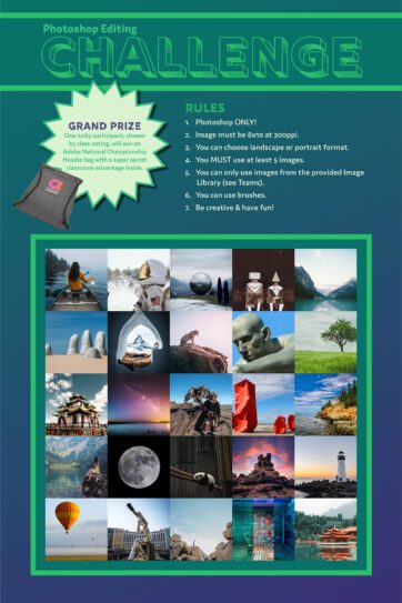
Based on these observations, I visited Unsplash.com and began curating a library of images for the project. I specifically looked for pictures to provide ethereal qualities to the idea while also meeting a minimum standard to allow easy editing. To help overcome the creative limitations felt by the students, I increased the number of photos to 25, with a minimum of five photos required in the final image.
The following project is presented based on Dick, Carey, & Carey’s Five Learning Components (2009). This framework is a reorganization of Gagne’s nine events of instruction.
Pre-Instructional Activities
Motivating Learners
For this project, it should be easy to motivate the learners. Benny Productions has a playlist of sixteen videos that demonstrate different editing challenges he’s participated in over the past few years. I would begin by choosing an edit race to show the class.
Objectives (Learning Targets)
- The student will correctly set up a Photoshop Canvas based on the provided specifications.
- The student will demonstrate selection and masking skills to isolate portions of images.
- The student will demonstrate the ability to layer and compose an image in Adobe Photoshop.
- The student will use non-destructive editing techniques to control brightness, contrast, colors, and other effects.
Prerequisite Skills
The prerequisite skills are dependent on where your students are with the required skills for the project. You may need to push/pull items between the content presentation and prerequisite skills.
Content Presentation
For this project, the students need several intermediate/advanced skills to be successful. Below is a list of specific skills I’ve identified for the students. In our case, we reviewed a few before beginning.
Required Skills
- Understanding file resolution & aspect ratios
- Destructive vs. Non-destructive editing
- Using selections tools (Marquee, Quick Selection, Color Range)
- Using masking tools (Quick Mask, Layer Mask)
- Using adjustment layers (clipping)
- How to color correct using Curves
- How to adjust brightness/contrast with Levels
- Using brushes (brush panel, brush presets)
Learner Participation

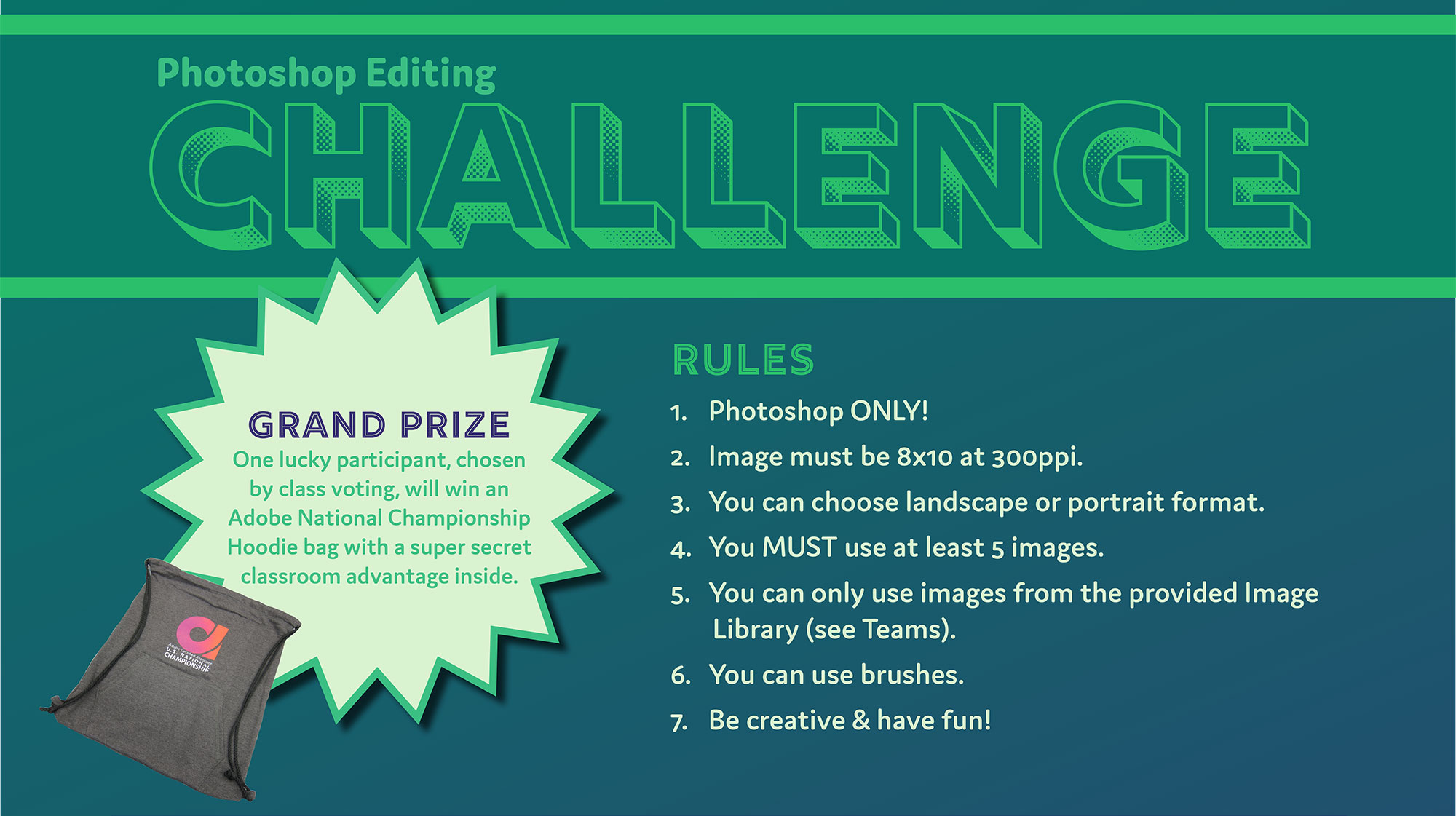
Once the students have the required skills, it’s time to present the project. For this project, I created a poster and had it ready as they entered the classroom. To keep the project simple, I provided the following rules.
Rules
- Photoshop ONLY!
- The image must be 8×10 at 300ppi.
- You can choose landscape or portrait format.
- You MUST use at least five pictures.
- You can only use images from the provided Image Library.
- You can use brushes.
- Be creative & have fun!
Timeline
The classroom format may dictate your project timeline. At the technical college, the students are in the class for 3-6 hours daily, depending on their schedule. I presented the project with a 12-hour timeline for completion. In a typical classroom setting, you may opt for a 1-2 week timeline.
Project Content
A poster was developed to inspire the students and introduce the project.

Unsplash Images
The following images were chosen for the project and shared with the students.
Assessment
For the first iteration, I did not assess the students based on the final product. We did this as a challenge for fun. However, in the future, I may re-present this project as a classroom assignment. In that case, I would look at three key aspects of their project: File Set-Up, Photoshop Skills, and Visual Design.
File Set-Up
First, I would look at their ability to set up the Photoshop Canvas correctly. The students need to read specifications and implement them correctly on the project.
Mastery: The student submitted a final JPG file set to the correct dimensions and utilizing the proper pixel density.
Proficient: The student submitted a final file, but there was an issue with either the file type, dimensions, or pixel density.
Developing: The student submitted a final file, but there were two issues with the file type, dimensions, or pixel density.
Basic: The student did not submit a file that meets any of the specifications outlined in the project directions.
Photoshop Skills
Second, I would look at their ability to use the different features of Photoshop correctly. Did the students use masks, how do the cutouts appear, did they attempt to match colors?
Mastery: The student successfully demonstrated the ability to use selection tools, masks, adjustments, and color corrections in a Photoshop composite image.
Proficient: The student demonstrated the ability to use different Photoshop tools, but some areas need additional attention before the image is finalized.
Developing: The student showed the ability to use different Photoshop tools, but the student must address several significant flaws before the image is finalized.
Basic: The student put in a minimal level of effort or did not finish the work adequately.
Visual Design
Lastly, I would look at the visual design of the project. While this may be subjective, I find it helps to use the Principles of Design to help lead the discussion with the students.
Mastery: The student applied the Principles of Design in a visually excited manner that gave the project a tremendous visual impact on the intended audience.
Proficient: The student applied the Principles of Design to layout the project. But, there were issues with the layout and composition that needed to be addressed.
Developing: The student tried to apply the Principles of Design, but the overall composition and layout were weak or unattractive.
Basic: The student did not try to apply the Principles of Design to the project.
Follow-Through Activities
For this project, I do not have any specific follow-through activities. If a student had significant issues, I would offer to help build a plan to reinforce the skills they had problems with during the project. I would also encourage the students to practice creating their compositions using different images available through websites such as Unsplash.com, Pexels.com, and Pixabay.com.
References
Dick, W., Carey, L., & Carey, J. O. (2009). The Systematic Design of Instruction (7th Edition), Upper Saddle River, NJ: Pearson.
Creative Commons

Photoshop Editing Challenge by Tom Smalling is licensed under a Creative Commons Attribution 4.0 International License.
Based on a work at https://designstudioacademy.com/photoshop-editing-challenge/.


Comments
Comments are closed.